
BLINK-182
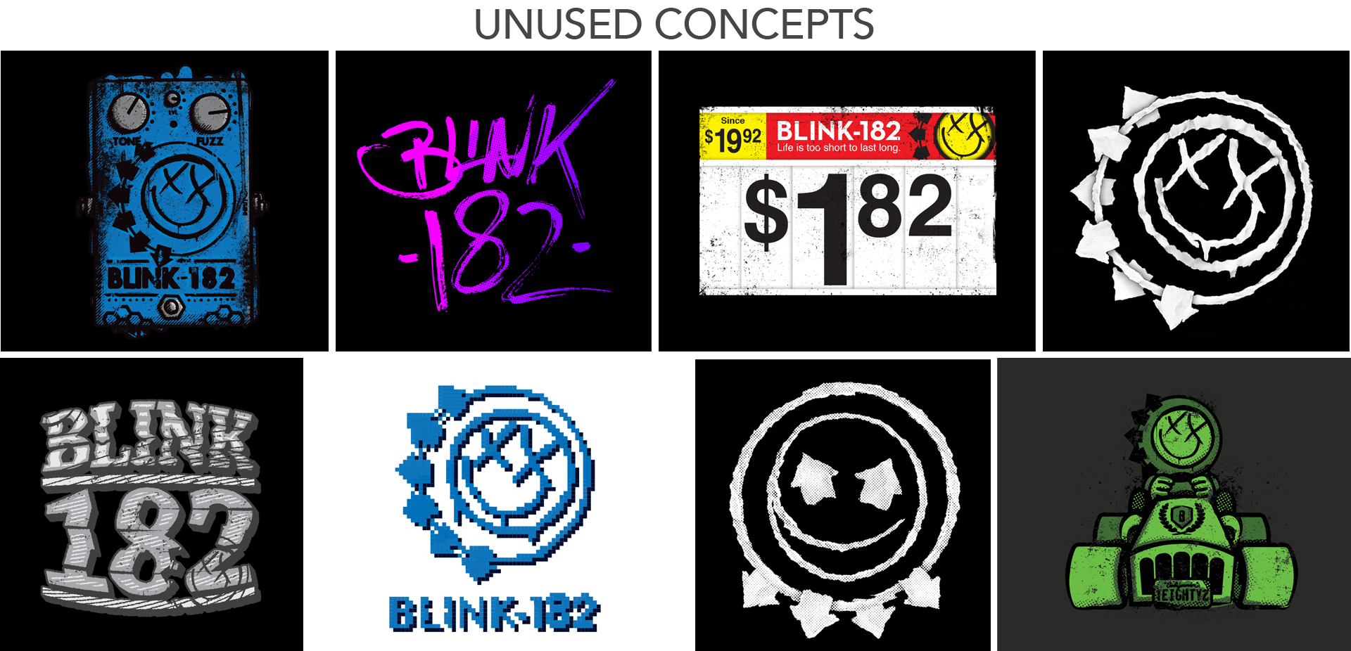
I was commissioned to develop official merchandise concepts for Blink-182 following my ongoing design work with Mark Hoppus’ apparel brand, Hi My Name Is Mark. The goal was to create graphics that reflected the band’s full tonal range. While much of their merchandise historically leaned into playful, lighthearted imagery, their music also carries darker and more aggressive themes, an area that hadn’t been deeply explored visually.
The project required balancing bold standalone graphics with the constraints of high-volume apparel production.
The Snare Drum
My favourite concept, The Snare Drum, was inspired by drummer Travis Barker’s live performance style. During shows, he often strikes his thumbs against the rim with such intensity that they bleed, a detail longtime fans recognize as part of his commitment and physicality on stage. This design translated that raw energy into a bold, minimal graphic built specifically for apparel.
Released as a one-day online exclusive, the shirt sold out immediately.
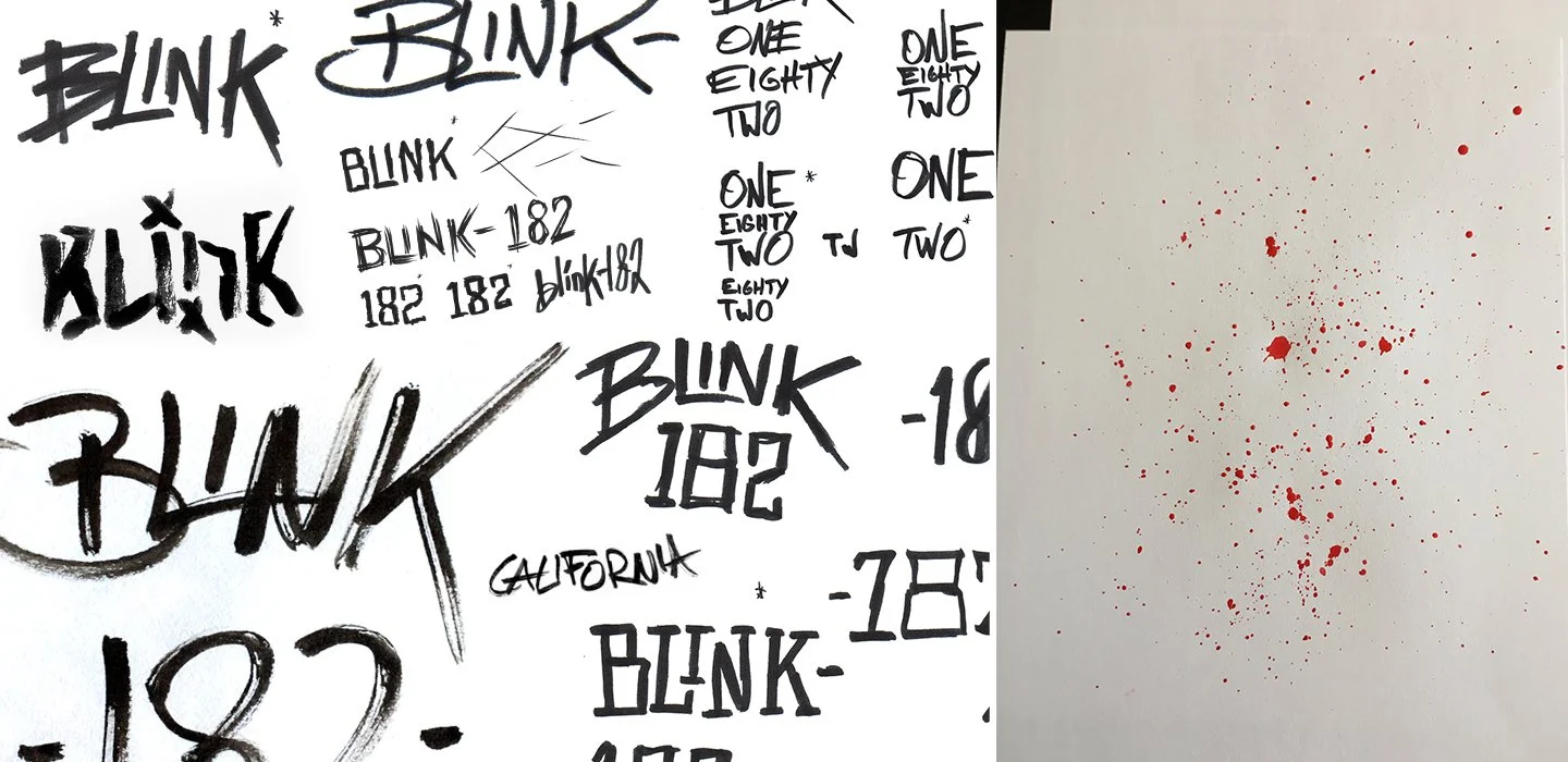
I also created an alternate version featuring custom lettering. In collaboration with the brand team, the decision was made to retain Blink-182’s existing logotype (originally designed by Brandon Rike) to maintain brand continuity. The alternate version is included below for comparison.
(A reference image of Travis Barker’s hands after a performance appears later in this case study.)


MANUAL
Occasionally, I step away from the screen and work with physical tools, brushes, ink, and raw materials that create textures digital effects can’t replicate. The blood splatter in The Snare Drum design wasn’t stock or simulated. I loaded a brush with red ink and created the marks by hand, letting the natural chaos of the medium produce something authentic and unpredictable.